
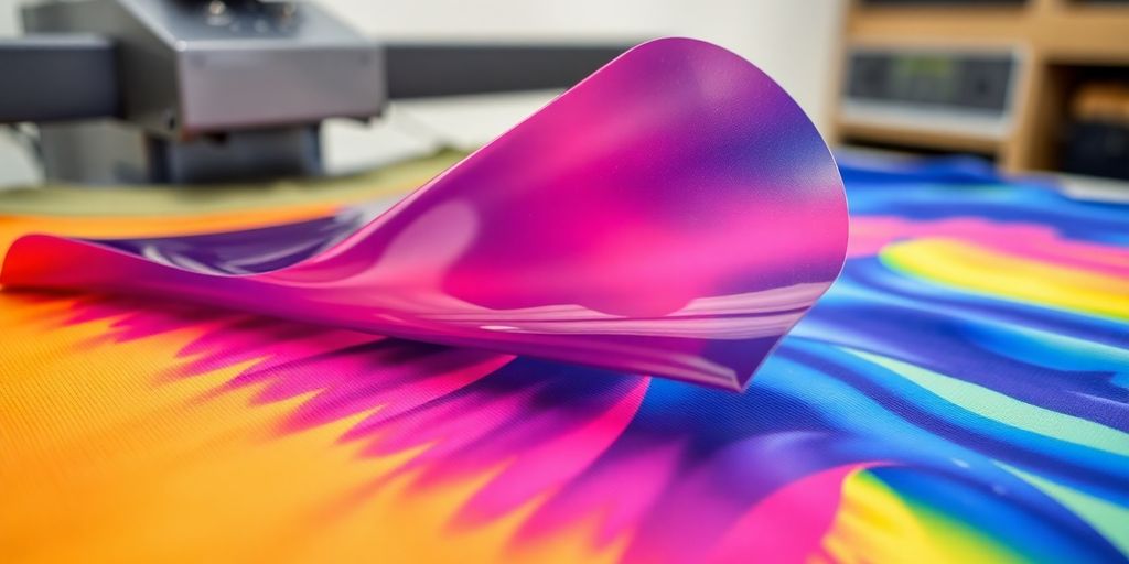
How to Convert Photoshop Designs into DTF-Ready Artwork
So, you've got these awesome designs in Photoshop, right? And now you want to get them onto t-shirts or other stuff using DTF transfer. It sounds simple, but there are definitely a few things you need to know to make sure your prints look good. We're talking about getting your Photoshop files just right so they come out perfect as a dtf transfer. It's not super complicated, but paying attention to the details really makes a difference.
Key Takeaways
- Always start with high-resolution images, at least 300 DPI, for your dtf transfer designs.
- Make sure your Photoshop canvas dimensions match your final print size to avoid weird scaling issues.
- Convert all text layers to outlines before exporting to prevent font problems on your dtf transfer.
- Remove any backgrounds to ensure your dtf transfer has proper transparency.
- Test print small batches of your dtf transfer designs to check colors and quality before big runs.
Optimizing Photoshop for DTF Transfer Artwork
Understanding Raster Graphics for DTF
When it comes to DTF (Direct to Film) transfers, understanding raster graphics is super important. Photoshop works with raster images, which are made up of pixels. The quality of your final print heavily relies on the resolution of your raster image. If your image is low-resolution, it'll look blurry and pixelated when printed. So, always start with a high-resolution image, ideally 300 DPI (dots per inch) or higher. This ensures that your design looks crisp and clear on the fabric. Also, be mindful of the file size, as very high resolutions can lead to large files that are difficult to manage.
Leveraging Photoshop's Strengths
Photoshop is awesome for DTF because it lets you do a lot of cool stuff with your designs. You can easily remove backgrounds, adjust colors, and add effects. It's great for detailed photo edits, raster-based artwork, textures, and shadows. Here's a few things you can do:
- Color Correction: Adjust colors to make them pop on the fabric.
- Background Removal: Create transparent backgrounds for seamless transfers.
- Adding Effects: Use filters and effects to give your design a unique look.
Photoshop's layering system is a huge advantage. You can work on different elements of your design separately and then combine them. This gives you a lot of flexibility and control over the final result. Just remember to keep your layers organized and named properly so you don't get lost!
Essential Tools for DTF Design
Photoshop has a bunch of tools that are super useful for DTF design. Knowing which ones to use and how to use them can really improve your workflow and the quality of your prints. Here are some must-know tools:
- Magic Wand/Background Eraser: For quickly removing backgrounds.
- Pen Tool: For creating precise selections and paths.
- Brush Tool: For adding details and textures.
- Type Tool: For adding and editing text. Remember to convert text to outlines to avoid font issues during printing.
Also, don't forget about adjustment layers like Curves and Levels. These let you adjust the colors and contrast of your image without permanently changing the original pixels. This is super helpful for fine-tuning your design and making sure it looks great on the fabric.
Setting Up Your DTF Transfer Canvas
Alright, let's get your Photoshop canvas ready for some awesome DTF transfer artwork. It's not rocket science, but getting these initial settings right can save you a ton of headaches later on. Think of it as laying the foundation for a perfect print. You wouldn't build a house on a shaky base, would you?
Achieving Optimal Resolution for DTF
For DTF, you really want to aim for a resolution of at least 300 DPI (dots per inch). Anything lower, and your prints are going to look fuzzy and unprofessional. Trust me, I've learned this the hard way. Imagine spending hours on a design, only to have it come out looking like a blurry mess. Not fun. So, when you're creating your canvas, make sure that DPI is set high!
Selecting the Right Color Mode for DTF
Okay, this is where things can get a little confusing. DTF printers use CMYK (Cyan, Magenta, Yellow, Key/Black), but it's often best to design in RGB (Red, Green, Blue) and then convert. Why? Because RGB gives you a wider range of colors to work with. Just make sure you convert to CMYK before you finalize your design and send it to print. This helps to avoid unexpected color shifts. Here's a quick rundown:
- Design in RGB: For a broader color palette.
- Convert to CMYK: Before printing to match the printer's color space.
- Use sRGB profile: For color consistency across devices.
Defining Canvas Dimensions for DTF
Canvas size is super important. You need to know the maximum print area of your DTF printer and set your canvas accordingly. It's also a good idea to add a little extra space around your design, just in case. This gives you some wiggle room when you're positioning the transfer on your garment. Here's a simple way to think about it:
- Measure your printer's maximum print area.
- Set your canvas dimensions to match, or slightly larger.
- Consider the size of the garment you're printing on.
Setting up your canvas correctly is half the battle. Take your time, double-check your settings, and you'll be well on your way to creating some amazing DTF transfers. Don't rush this step – it's worth the effort!
Preparing Your Design for DTF Transfer
Removing Backgrounds for Transparent DTF
Okay, so you've got your design ready to go, but it's sitting on a background you don't want. For DTF, you need that background gone! Transparency is key to a clean DTF transfer. In Photoshop, there are a few ways to tackle this. The Magic Wand tool can work wonders if you have a simple, solid-color background. Just select it and hit delete. For more complex backgrounds, the Pen tool or Background Eraser tool might be your best bet. Take your time and zoom in to get those edges nice and crisp. You don't want any stray pixels messing up your final print.
Converting Text to Outlines for DTF
If your design includes text, you absolutely must convert it to outlines (or vectors) before sending it off for DTF printing. Why? Because if the printer doesn't have the exact font you used, it'll substitute it with something else, and your design will look all kinds of wrong. Converting to outlines turns the text into shapes, so it doesn't rely on having the font installed. In Photoshop, this usually involves rasterizing the type layer, but be aware that this can make the text uneditable. In Adobe Photoshop and Illustrator, you can create vector files like .ai, .eps, or .svg, which are ideal for DTF printing, as they allow for easy scaling without losing quality.
Flattening Layers for DTF Compatibility
Before you export, it's a good idea to flatten your layers. This simplifies the file and reduces the chances of any unexpected issues during the printing process. Flattening merges all your layers into a single background layer. This can be a destructive process, so always save a separate copy of your layered file in case you need to make changes later. To flatten, go to Layer > Flatten Image. Just make sure you're 100% happy with your design before you do this!
Think of flattening layers like packing for a trip. You could bring a bunch of separate bags, but it's way easier to consolidate everything into one suitcase. It's simpler to manage and less likely to get lost. Same goes for your Photoshop file. Flattening reduces complexity and makes it easier for the printer to handle.
Advanced Techniques for DTF Transfer Quality
Creating Halftone Effects for DTF
Halftone effects can seriously improve the feel and look of your DTF transfers, especially when dealing with gradients or trying to achieve a vintage aesthetic. Halftones replace solid colors with tiny dots, creating the illusion of different shades and tones. This is super useful because it can reduce ink usage and improve the breathability of the print, which is great for larger designs.
Here's a quick rundown:
- Experiment with different dot sizes and angles to find the effect you like best.
- Use Photoshop's built-in halftone filter (Filter > Pixelate > Color Halftone) to get started.
- Make sure your resolution is high enough (300 DPI is a good starting point) to keep the dots crisp and defined.
Applying Black Knockout for Breathability
Black knockout is a technique where you remove black ink from areas where other colors overlap. This is especially important for DTF because too much ink can make the print feel heavy and stiff. By knocking out the black, you reduce the overall ink density, making the print more breathable and comfortable to wear. It's a simple trick that can make a big difference in the final product. Think of it as strategically removing ink to improve the feel of the design. You can also check out DTF printing essentials for more information.
Managing Gradients and Small Details for DTF
Gradients and small details can be tricky with DTF, but they're definitely achievable with the right approach. The key is to make sure your gradients are smooth and your details are sharp. Here's how:
- Use a high resolution (at least 300 DPI) to capture fine details.
- Avoid very subtle gradients, as they may not translate well to DTF.
- Consider adding a slight outline to small details to make them more visible.
When working with gradients, it's often helpful to add a bit of noise to the gradient layer. This can help to break up any banding that might occur during printing. Also, always do a test print to see how your gradients and details are coming out. It's better to catch any issues early on than to waste a bunch of materials on a flawed design.
Exporting Your DTF Transfer File
Okay, so you've tweaked your design in Photoshop until it's perfect. Now comes the part where you actually get it ready to send off for printing. This step is super important because the file you export will directly impact the quality of your final DTF transfer. Mess this up, and you might end up with blurry images or colors that are way off. Let's get it right.
Choosing the Best File Format for DTF
PNG is generally the best file format for DTF transfers. It supports transparency, which is crucial for designs without backgrounds. While other formats like JPEG might be smaller in file size, they can introduce compression artifacts and don't handle transparency well. TIFF files are also an option, offering lossless compression, but they can be quite large. Here's a quick comparison:
| File Format | Transparency Support | Compression | File Size | Use Case |
|---|---|---|---|---|
| PNG | Yes | Lossless | Moderate | Best for DTF |
| JPEG | No | Lossy | Small | Not Recommended |
| TIFF | Yes | Lossless | Large | Acceptable, but large |
Ensuring Transparency in DTF Exports
Transparency is what allows the design to seamlessly blend with the fabric. When exporting, make sure you've properly removed the background in Photoshop and that the file format you choose (ideally PNG) preserves this transparency. Double-check your export settings to confirm that transparency is enabled. If you see a white or colored background where there should be none, something went wrong. You can use Photopea for custom DTF transfers if you don't have Photoshop.
Verifying Resolution and Quality for DTF
Before you send your file off, take one last look at the resolution and overall quality. Zoom in to 100% to check for any pixelation or blurriness. Remember, what you see on your screen is what you'll get on the transfer. If the resolution is too low, the print will look fuzzy. If you've used any effects or filters, make sure they're rendering correctly at the final size. It's better to catch these issues now than to waste time and money on a bad print.
Always, always, always double-check your file before exporting. It's a small step that can save you a lot of headaches down the road. Make sure the resolution is high enough, the colors are accurate, and the transparency is preserved. A few minutes of extra attention can make all the difference in the final product.
Avoiding Common DTF Transfer Pitfalls
DTF transfers are pretty cool, but it's easy to mess things up if you're not careful. I've learned this the hard way, believe me. Here's what to watch out for so you don't end up with a pile of unusable prints.
Steering Clear of Small Details in DTF
Small details are the enemy! Tiny lines, dots, and intricate patterns often don't transfer well and can peel off easily after a few washes. It's better to simplify your design or avoid super-fine elements altogether. Think bold and clear.
Managing Large Solid Areas for DTF
Big blocks of solid color can be a problem. They make the fabric stiff and less breathable. No one wants to wear a shirt that feels like plastic. Plus, all that ink can crack over time. Consider breaking up large areas with textures or negative space. This will also help with DTF film issues.
Addressing Color Shifts in DTF Printing
Color shifts are a real pain. What you see on your screen might not be what you get on the fabric. This is especially true for black-on-black designs, where the black ink can look faded or grayish. Always do a test print to check the colors before running a whole batch. Here's a quick guide:
| Color | Potential Issue | Solution |
|---|---|---|
| Black | Fading, graying | Use a richer black ink, add more layers |
| White | Bleeding | Adjust choke settings, use a higher quality film |
| Gradients | Banding, unevenness | Increase resolution, use dithering |
It's important to remember that DTF printing isn't perfect. There will always be some variation in color and detail. The key is to minimize these issues through careful design and testing.
Also, gradients that fade to transparent often look bad. The transition can be harsh and uneven. It's better to use solid colors or find other ways to create depth in your design.
Tips for Superior DTF Transfer Results
Utilizing Mockup Templates for DTF
Mockup templates are super useful. They let you see how your design will look on different products before you even print. This saves you time and money by preventing mistakes. You can find tons of free and paid templates online. Try to find ones that match the exact product you're planning to use. It's a small step that makes a big difference.
Saving Presets for Efficient DTF Workflow
If you find yourself using the same settings over and over, save them as presets! This is a huge time-saver. Whether it's resolution, color mode, or export settings, presets keep your workflow smooth and consistent. Think of it as creating your own custom DTF profile. Here's a quick guide:
- Photoshop: Go to Edit > Presets > Preset Manager.
- Specific Settings: Save settings for resolution, color profiles, and file formats.
- Organization: Name your presets clearly so you can easily find them later.
Conducting Test Prints for DTF Accuracy
Always, always, always do a test print. Seriously. Colors can look different on screen than they do on fabric. A test print lets you catch any issues before you commit to a full run. It's the best way to ensure your final product looks exactly how you want it. You can use DTF transfer methods to test your designs.
Test prints are your friend. They might seem like an extra step, but they'll save you from wasting materials and ending up with a bunch of unusable prints. Plus, they give you a chance to fine-tune your settings and get everything just right.
Conclusion
So, that's pretty much it! Getting your Photoshop designs ready for DTF printing might seem like a lot at first, but it's really just about knowing a few key things. You want to make sure your files are clean, your layers are set up right, and you export everything the correct way. If you pay attention to those details, your prints will look good and your customers will be happy. It's all about getting those small steps right to make a big difference in the final product.
Frequently Asked Questions
What software do I need for DTF printing?
When you're making designs for DTF printing, it's best to use vector-based software like Adobe Illustrator or CorelDRAW. These programs are great because they let you make designs that can be resized without getting blurry. If you're on a budget, there are also some good online design tools you can try.
How do I prepare my digital artwork for print?
To get your artwork ready for printing, you need to make sure your images are super clear (high resolution), saved in the right file types, and that your colors will look correct when printed. Think about whether your design is made of pixels (like a photo) or lines and shapes (like a logo). Also, pay attention to how your design is laid out. We're here to help if you get stuck!
What do I need to make my own DTF transfers?
To create your own DTF transfers, you'll need special inks, the right materials to print on, and a good understanding of how to get your design ready. Make sure your designs have a high resolution and that the colors are set up correctly. Learning these things will help you become part of the DTF community!
Is RGB or CMYK better for DTF printing?
For DTF printing, you should use CMYK colors. This is the best color setting for your designs. Remember to check what file type your printer needs and how the image resolution affects the final print. Also, think about how your design is arranged on the page. Make sure your file type works with your printer's needs.
What is a raster graphic?
A raster graphic is like a picture made of tiny colored squares, called pixels. When you make these pictures bigger, you can start to see the squares, and the picture might look blurry or blocky. For DTF, you need these pictures to be very clear and detailed, so they look good when printed on fabric.
What are the strengths of Photoshop and Illustrator for DTF printing?
Photoshop is really good for editing photos, adding textures, and making designs with shadows. It's also great for working with raster images. Illustrator, on the other hand, is perfect for logos, text, and designs with sharp edges because it uses vectors, which means you can make them any size without losing quality. Both programs let you control how clear your design is, the colors, and if parts of it are see-through, which are all important for good printing.


